[spb_text_block pb_margin_bottom=”no” pb_border_bottom=”no” el_class=”pb0 mb0″ width=”1/1″ el_position=”first last”]
[sf_visibility class=”visible-lg”]
[one_third]
[sf_iconbox image=”ss-desktop” character=”” type=”standard” title=”Desktop view” animation=”fade-from-left” animation_delay=”0″]
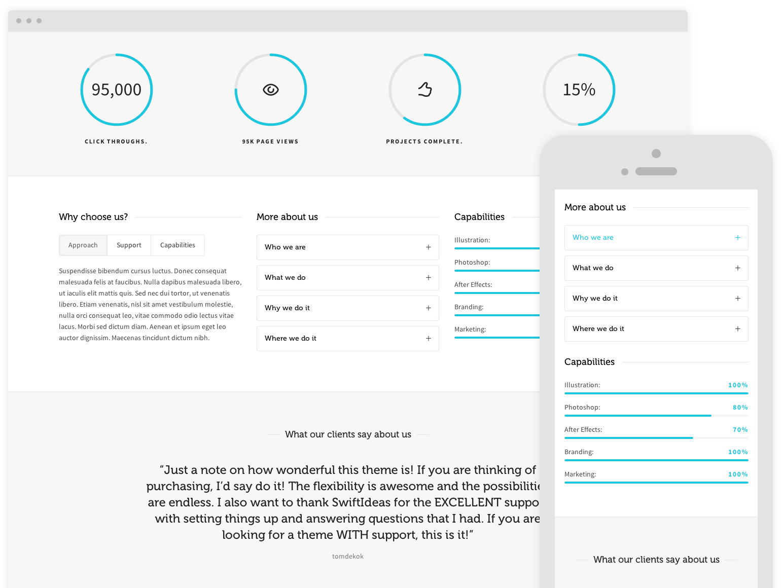
To the right is an example of content that’s perfect for desktop viewing, but not particularly well suited to tablet viewing and mobile devices.
Re-size your browser to see how our responsive visibility shortcode allows you to show/hide content.
[hr]
[icon image=”ss-pointleft” character=”” size=”medium” cont=”no” float=”none”]
[/sf_iconbox]
[/one_third]
[two_third_last]

[/two_third_last]
[/sf_visibility]
[sf_visibility class=”visible-md visible-sm”]
[one_third]
[sf_iconbox image=”ss-tablet” character=”” type=”standard” title=”Tablet view” animation=”fade-from-left” animation_delay=”0″]
Ok, so no we’re at Tablet size you’ll notice the image to the right has changed. This is one is more suitable for tablets.
Keep re-sizing to see the phone specific content.
[hr]
[icon image=”ss-pointleft” character=”” size=”medium” cont=”no” float=”none”]
[/sf_iconbox]
[/one_third]
[two_third_last]
[/two_third_last]
[/sf_visibility]
[sf_visibility class=”visible-xs”]
[sf_iconbox image=”ss-smartphone” character=”” type=”standard” title=”Phone view” animation=”fade-from-left” animation_delay=”0″]
Now we’re at phone size we’ve decided that we shouldn’t use an image. With this handy shortcode your content will always be device appropriate. So… are you impressed?
[sf_button colour=”transparent-dark” type=”stroke-to-fill” size=”standard” link=”http://” target=”_self” icon=”” dropshadow=”no” extraclass=””]YES, YOU HAVE BLOWN MY MIND![/sf_button]
[sf_button colour=”gold” type=”standard” size=”standard” link=”/features/” target=”_blank” icon=”” dropshadow=”no” extraclass=””]NO, TRY HARDER[/sf_button]
[/sf_iconbox]
[/sf_visibility]
[/spb_text_block]

